Website Redesign
Students Offering Support (SOS) is a multi-national charitable and entrepreneurial initiative that currently focuses on providing support and developing individual SOS chapters within post-secondary institutions across North America, making an impact on a local and global scale. This project was about identifying existing pain points and addressing areas in the website for modernization and improvements.
Role: Lead UX / UI Designer
Challenge
The client was looking to modernize their website both in terms of the system integration as well as the website design. They wanted to ensure that the message of who they are, what they represent, and the services they provide is clear to the visitors.
SOS was looking to understand,
Approach & Activities
I started by first understanding the business need for the redesign. I conducted a workshop with my key stakeholders to unpack the purpose and objective of this project through a business model assessment and value proposition analysis. This approach led to 3 main goals for the redesign:
increasing engagement with both students and donors,
improving user experience, and
increasing conversions for donations received.
I then began planning and conducting key activities.
Research and analysis: I began by gathering information about the current website, its users, and their needs. This involved conducting user interviews, and surveys to identify pain points, user expectations, and preferences.
Information Architecture: Next I began addressing the complex and fragmented information architecture of the website to create a more logical and user-friendly organizing structure.
Design: Once I had the IA squared away, I began wireframing, starting from low-fidelity to high-fidelity designs. Since I was the lead designer on the project, I was also accountable for establishing a new design system and brand guide that would be used through their digital and analog marketing materials.
“How might we accelerate growth in funding as well as encourage more students to participate in the program?”
Business Need Assessment
To better understand the business's goals, objectives, and challenges to identify how UX design can help address those needs, I identified all key stakeholders and conducted a workshop with them. Throughout this workshop, I gathered business requirements and needs for the redesign, unpacked any pain points or challenges that the business is facing, and defined success metrics that will be used to measure the effectiveness of the website redesign project, all using tools such as the value proposition canvas and business model canvas to facilitate the discussion.


Research and analysis
The purpose of this research was to evaluate the current website's performance, unpack user behavior and pain points, and identify areas for improvement. After performing a thorough heuristic evaluation of the current state website, I began planning for research. For this phase of the work, I conducted both quantitative and qualitative research through an online survey and in-depth user interviews.
Online Survey
The survey was sent out to 35 participants, including existing SOS users as well as nonusers. A 12-question survey was focused on 3 key areas of investigation:
An understanding of what SOS does as an organization
Users’ experience with interacting with the website and whether its’ goal was clear
Users’ expectations of SOS and the content that should live on the website
User interviews
Out of the 35 survey participants, I interviewed 6. This decision was based on the analysis of the survey results and participants’ consent to be interviewed.
45-minute interviews were geared towards unpacking participant responses as well as going in-depth on their pain points and a card sorting activity to meet their mental modals of the information architecture.
Research Synthesis
The synthesis involved all core team members including myself, the program director, and a tech analyst. We affinitized all data from both the survey and interviews to derive key areas of improvement and establish a high-level information architecture of the website. Some common themes that arose in synthesis were:
Confusing website information architecture
Unclear content hierarchy
Content overload to clearly understand the purpose and mission of the organization
Inconsistency in layout and design
Lack of next steps or actions
Information Architecture
Before diving deep into designs, we focused on redefining the current information architecture to organize and structure the content of the website in a clear and intuitive manner that helps users find what they are looking for easily and efficiently. We decided to go with a flat navigation for the website to simplify a complex structure and help users understand the relationships between different pieces of content and how to navigate through the website, creating a navigation that is consistent and meaningful to users. A website such as SOS should have a simple structure, without creating chaos or complexity in navigation.
Evaluation Via Tree Tests
Through tree testing with research participants, I was able to identify key site structure elements to define a simple site map for the website.
Content Audit
By running a content audit listing exercise, we collectively decided what to keep, what to kick, and what to combine to reduce the content overload.

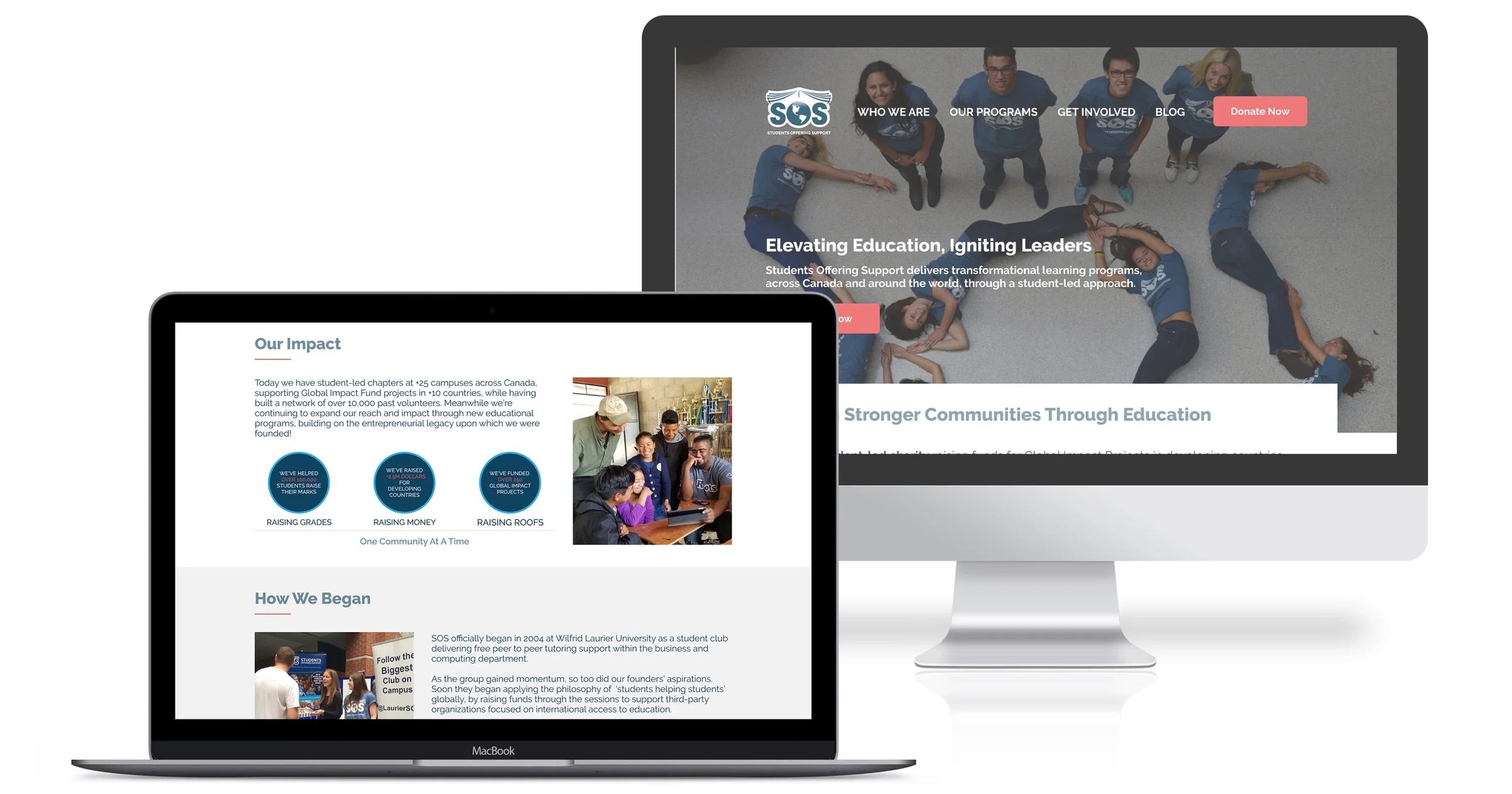
Screen Design
Once we had a better understanding of the business needs, objectives, user expectations, and paint points, I began creating low-fidelity wireframes to allow for rapid iteration and feedback from stakeholders.
We validated the overall concept and information architecture of the design before investing time in creating higher-fidelity designs. I was able to focus on the functionality and user flow of the design rather than getting bogged down in visual details.
With high-fidelity wireframes and designs, focus began to shift to the visual design and branding of the website. I established a design system with typography, color palette, imagery, and other visual elements that are critical to creating a consistent and engaging user experience. We were then able to communicate design concepts and ideas more effectively to stakeholders and team members as well as collaborate more effectively with developers to ensure that the design is implemented correctly.


With a good story to tell, SOS redesigned website will be able to capture its users and help people become better ambassadors of the important work this organization does.
For the final design, we focused on delivering on the thesis question:
