Customer Self Service Portal
Etisalat is the largest telecommunication corporation in the GCC. Serving both consumer & business markets, Etisalat serves 11.6 million customers and over 300,000 small, medium, and large enterprises and government customers in the UAE. As part of their organizational transformation project, the customer self-care portal was to be redesigned and optimized to meet the newly defined brand guidelines and design principles.
Role: UI/UX Designer
Challenge
The existing digital channel for customers was inconsistent with analog channels, features, and capabilities were fragmented and there was a general lack of brand identity. This led to larger volumes of customers reaching out to the call centre or the retail stores. The objective of this project was to create a seamless experience that enables customers to self-serve without the need for customer support services, serve on customer expectations from such a portal, and align to business needs.
What we did
We began our assessment by understanding stakeholder goals and objectives, conducting a heuristic evaluation of the existing portal, and applying design research methodologies to unpack customer pain points and expectations.
By understanding the current state journey, we were able to identify gaps in the experience to begin establishing design requirements which were then converted into business requirements. Throughout this process, we aligned 5 core principles to design the customer portal.
Radical simplicity
People first
Be human
Be bold
Build for context
Design Approach
We worked alongside content designers, scrum masters, product owners, developers, and QA specialists in the 3-week design and dev sprint cycles. During the 3-week design cycles, we took in business requirements, developed wireframes, and visual design, and conducted usability testing to inform the final hand-off with the development team.

Design Process for creating the Dashboard
The first step in designing an intuitive customer dashboard is to understand the needs of the users. What information do they need to see, and how do they prefer to see it?
We visited the call centres and spent time listening in on customer calls to better understand their expectations and needs from the service.
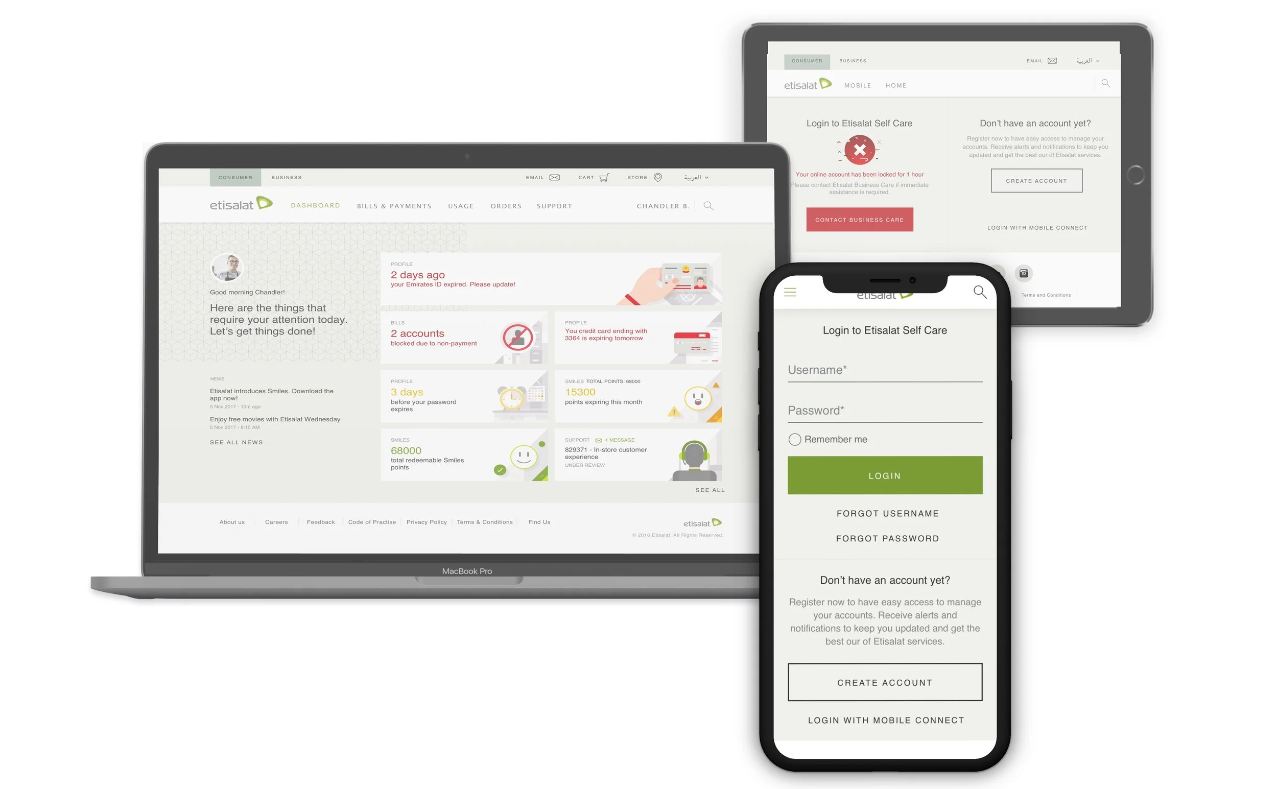
Dashboard design began with an iterative approach through conducting A/B tests in order to validate how customers would react to error states. A personalized dashboard approach meant that it should be flexible and adaptable to the changing needs of the user.
We decided to use a modular card design layout to display pertinent information, that would change contextually based on user actions both within the portal and outside of it (i.e. seamless integration with call centre and retail store channels).
Defining a clear path to success for customers
Applying design principles throughout the experience, we designed a responsive portal that helps the user through simple actions and clear instructions.
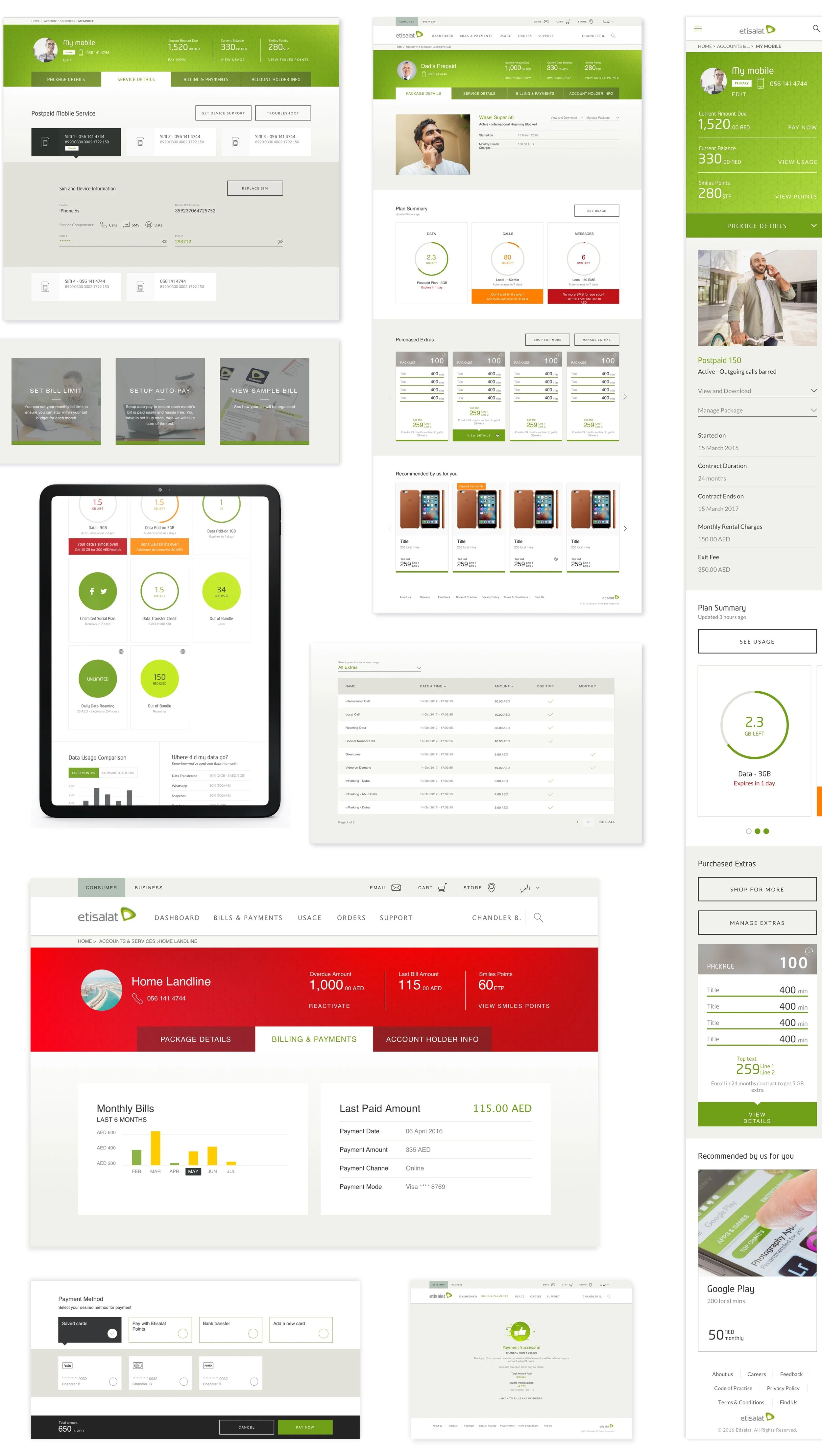
We started with defining a clear and intuitive information architecture that is easy to navigate for users. This means breaking down the different areas of billing and usage into separate sections, such as payment history, account details, usage reports, and plan details.
Since billing and usage data can be complex and overwhelming for users. We used data visualizations to make the data more manageable, and present the information in a clear and concise way.
From our research, we understood that users want their information personalized to their contextual needs, therefore we included the ability to view billing and usage data by different time periods and to alert the user if and when they reach a usage threshold.
By allowing the user to make informed decisions to change their service or add features, we made the portal flexible to their needs.
All this was delivered after validating the features through usability testing.
Design Documentation
To effectively hand off design documentation, we consolidated and organized all design assets. This included annotated wireframes, high-fidelity mockups, interactive prototypes, and design asset export into Zeplin. Within the documentation, we provided detailed explanations of the design decisions that were made. Finally, collaborated with the development team to ensure that they have all the information they need to implement the design. This included answering questions, providing clarification, or working together to resolve any issues that arise during the development process.

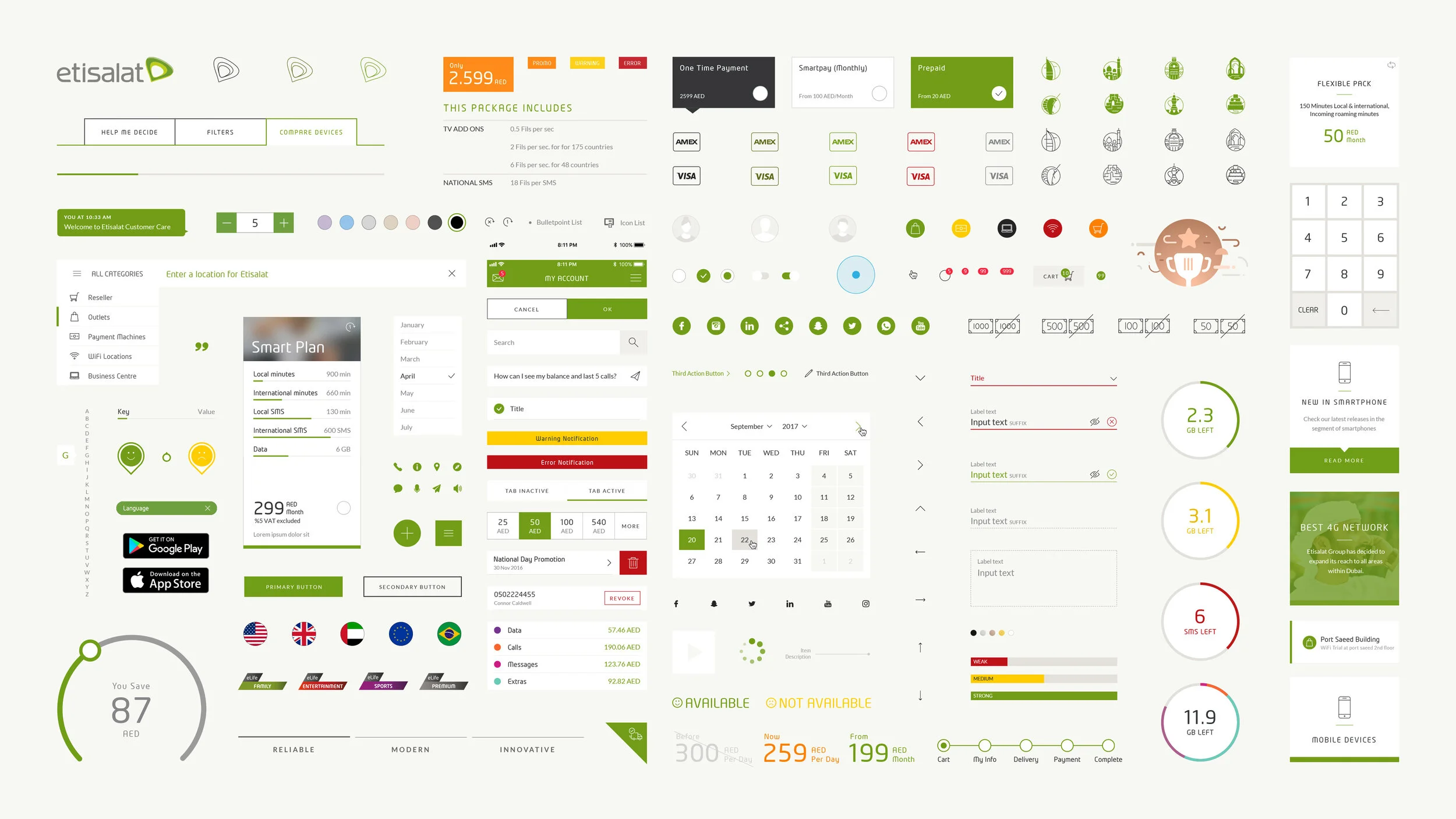
Compass Evolution (Design System)
As we continued to make iterations of the existing components or create new ones, we ensured all components were documented in detail within the Compass library - maintaining consistency across all working teams.


Outcome
To that end, we delivered consistent, streamlined, and contextually relevant customer experience by creating a self-care channel that would act as an intelligent personal assistant that facilitates the management of customers’ accounts as efficiently as possible; through reorganizing the information architecture, content hierarchy and introducing new interaction patterns and visual elements. We successfully achieved our goals of:
Increase customer satisfaction while maintaining a seamless experience across the online and digital channels
Cost Optimization is achieved through a better accommodation of customer needs by revisiting self-service channels
Systems rationalization for web, commerce, and self-care capabilities